Thursday, June 23, 2011

Bathroom #1

The master bath adjoins the closet on one wall.  We wanted cubbies in the closet, and due to our fondness for open storage we decided to make one unit that served both sides. 


The shower is across from the water closet, each with their own dedicated space, allowing for more privacy.  Further down is the laundry room, making the whole room very efficient for how we will use it. 


As we were tiling the whole upstairs bathroom suite we decided to keep going with the floor tiles all the way up the shower walls.  The ceiling has a white, smaller tile, rectagular in keeping with the brick pattern.  A small bench was built into the corner, 30" across, prefab aluminum filled with concrete and tiled over.   


The opposite corner has a 16” shelf made with cut tile pieces.


Not too cramped yet not cavernous either, the shower measures around 4’X4’. The floor is 1”x2” cut slate tile sheets.  The ceiling is off-white ceramic.

 Sexy, no?


When we ordered the granite for the kitchen counters we got a great deal on the counters for the bathroom vanities, as long as we picked from remnants it would all be the same flat rate.  I was a bit nervous "would be a lot of small shoddy pieces?"  But the selection was actually quite good.  Upstairs we went with Venetian Gold and were fortunate enough to find enough for the main vanity,


the water closet 


and at that price it went into the laundry room as well.  


Sunday, May 22, 2011

Under foot

I’m in love with our floors.  And not just because I can walk all over them . . . . Uh, sorry, all bad jokes aside, I am quite taken with them.  We struggled with what to do for a while before the answers seemed to materialize right before our eyes.  OK, now that’s starting to sound like metaphysical mumbo-jumbo, but we spent hours of puzzling over them, looked around online, visiting store after store and still not knowing what we wanted.

Initially we were going to go with mostly hardwood but what we really liked was also really expensive.   “Why don’t we just tile everything?”  Downstairs anyhow.  I grew up in Florida and this seemed like a perfectly reasonable solution.  I like tile.   And this simplified things immensely.  Finding the right tile, OTOH . . . Again, quite a lot of what we liked was pretty expensive.  Aside from the regular outlets we were also checking liquidation centers. The trick here is you have to hit them regularly until you find something you like.  I was starting to worry, amidst pallets stacked high with the blandest ceramic I'd ever seen, until I rounded that corner and John says "my eyes lit up" and he knew that was the one.  Or something like that.  


It looked like storm clouds rolling in over the ocean.  Being porcelain it would be durable, which was also something that was important to us.   And having the same tiles throughout the first floor would help in creating the fluid feel we were looking for.  

The tile for the master bath/closet and laundry became much easier once I overcame my aversion to brown/beige.  It's not so much that I dislike brown, it's just I'd seen too much suburban tract design (Hello Florida!) and I get twitchy.  Fortunately I was able to find some modern use of browns, although I still get a bit nervous on occasion.   But this tile was good.  12x24, so we could do a brick pattern, and enough variation in the color that it gave us more decorating freedom.


As the master closet, bathroom and laundry room will all be one suite we used the same tile throughout.

 The rest of the upstairs was a lot of puzzling as well.  We definitely wanted solid hardwood.  We considered bamboo for a while, as there are some really pretty ones, and some of the newer strand woven types have an incredibly high Janka rating, but in the end still had some doubts.  Too new, not enough really good information out there.  So we decided to stick to traditional hardwood.  We still wanted something fairly tough but also interesting.  I love tigerwood (not Tiger Woods) but that starts getting really pricey.  All the oak we saw was "meh", and a bit soft.  Just when we thought we were going to pull our hair out we found HICKORY!  It was a happy moment.  Hard enough, but not too hard, pretty and affordable.  

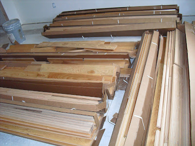
   Wood floors have to acclimate before installing, allowing the moisture content to adjust to normal living conditions.  If you don't you can end up with separating and gapping or swelling and buckling.  The wood was brought in, boxes opened and allowed to breathe for two weeks before it was installed.  Fortunately we had heat by this point so "normal living conditions" were no problem. 

Finally, acclimated, they could start being installed.  Tarpaper went down first to prevent squeaking, then the first row of planks could go down.  The hallway was done first as it had to line up with the bedroom, so the first rows ran from the front to the back of the house.  Doorways and the stairs had to be taken into account as well so this was a  bit tricky.


The planks were first laid out to be sure that none of the joints lined up next to one another so the end result would be random and more natural looking.  Once in place they were nailed down with a pneumatic gun which you hit with a rubber mallet on the tung side of the plank.


Mostly this went well, until getting to the last rows, we ended up a bit too close a few times and ended up with dents in the drywall.   Oops.  Switched over to a standard nail gun then finally hammer and nails.  The hall was the worst of it, once done the rooms went considerably faster. 

Done!  Standing back to admire our work we could see the beauty and natural variation of the wood.


The stairs were the last to go in.  We'd been working with temporary treads throughout most of the construction as you don't want your permanent stairs in while people are tracking mud, sawdust, grout, mortar and all manner of substances in and out of the house. 


We had initially planned on trying to match the hickory by staining white oak, then realized it would be just about impossible.  So we went with red oak instead and figured we'd do something completely different.  We'd been researching and reading about various alternative stains (mostly vinegar and steel wool) or possibly liming, but that would have required a lot of experimentation and the potential to mess them up was pretty high.  John had done some pickling so we felt a bit more confident with that method, although we were going dark rather than light.  

Most pickling is done with light colors or white, meant to give an aged or antique look to wood, usually furniture, but you're basically staining.  We tried some light paint but it looked a wee shabby chic (ACK!) so went dark instead.  Initial results are good, but we still aren't sure.  


Stay tuned for developments.

Thursday, March 31, 2011

The Evolution of the Kitchen - pt. 2

So, where was I now when work so rudely stuck its nose in?  Ah yes, the kitchen and how it came to be. Is coming to be.  We have the shape, the walls, the tile, which looks a bit scruffy in the pictures due to it being freshly grouted (more on the tiles later) and an idea of what we wanted.   If we were working with a contractor we’d have driven him nuts by this point, “Hey, can you move the wall over a bit?  Add some built ins, shelves there?  No there . . .” and so on.  

   We could finally start bringing in cabinets.  Truckload after truckload (fortunately it’s not that far away) and the shell was filling out.  

 That hole in the wall in front of the cabinet with the big hole is my spice rack.  Or will be.  Did I mention I cook?  Lots?  That big hole in the cabinet is where the oven goes.  I've never had a wall oven and we lucked out with this one.  We bought the oven from the Sears outlet store (In December, so it's been in our living room ever since) at 50% off because it was missing its box.  !!!!!   The oven will actually sit lower, the upper two drawers have been removed and the microwave will go above.  We found the microwave, which is a convection combo, discounted by 75%. 


The cook-top goes under the space for the exhaust fan, natch.  Gas, natch.  It arrived this week and I'm currently infatuated with the knobs.


Open layout, open shelving, open hole where the fridge goes.  (And how many job sites have an espresso machine?)  We bought the fridge and dishwasher during the Black Friday sale at Home Depot which saved us 50% on those too.  Fortunately we were able to put off delivery until March so we aren’t tripping over them in the apartment.  Instead we’re tripping over them at the house.  The shelves next to the fridge will hold mixing bowls, plates, nicer cookware, underneath will be a prep area. 


 The Habitat For Humanity Restore has been a great resource as well.  We picked up a new stainless double (60/40) sink for about 1/5 of what we would have paid retail.  We were originally thinking of going with black appliances but managed to get them all in stainless for less than what we would have paid for black .  All that money saving meant it was time for a splurge.   Behold, the faucet.  Not the priciest we found (OMG, people pay THAT MUCH for a faucet???) but yeah, it was a splurge.  Purty isn't it? 


The cabinets will be painted battleship gray,
or Seal Grey, and the process of taking off the doors, removing hardware and priming has begun.   Next comes sanding then painting.  


 For this we have a high tech work space . . .


. . . and sophisticated drying racks.  


 Today we took a trip out to Stone World to approve the granite for the counters.  Here is our slab. 


They volunteered to try to cut so that lines and streaks would be minimized, but we requested that they actually try to use them prominently.  I think it looks more like real stone and makes it more interesting.

Monday, March 21, 2011

The Evolution of the Kitchen - pt. 1

For many people, if given the opportunity, the kitchen would be the one room that gets the most consideration when building a house.  But perusing what’s on offer in print and online there are many beautiful examples, but on closer inspection they tend to fall short on practicality.  Sure they look good, but how well do they function?  As someone who spends an awful lot of time using mine, I was aiming for both. 

 The first hurdle was trying to get the most use out of limited space.  The placement of the front door (we considered moving it) would create an awkward traffic flow no matter which side of the house we chose.  Having a counter with stools was also a possibility, leaving the front of the kitchen open, and a table that would be pushed against the wall when not in use. 


 This presented us with other design problems, having the kitchen be the first thing you see when walking in the door, the arrangement of the cabinets and appliances so that you weren’t staring at the side of the fridge or too close to the stove, the table getting in the way and various inconveniences.  We cut out stencils to help visualize different configurations and generally racked our brains (beat our heads against the wall) trying to make it work.


In a fit of inspiration (frustration), I realized I didn’t actually want a dining room.  Who even uses them?  Aside from dumping stuff that you’re too lazy to put where it belongs, and believe me, I live there.  How about a big honkin’ eat-in kitchen? Yes! With that problem solved we still wanted some kind of separation from the front door but just slapping in a wall would be rather clunky.  The back wall of the living room was already built at an angle to steal a bit of space for the room (my office) on the other side, but also to create a sight line that didn’t come to an abrupt halt.  The wall of the kitchen would reflect that, which was easier to see once the drywall went up and the tiles went down.


We toyed with different possible openings in the wall to make the kitchen less claustrophobic, but none of them seemed quite right, and having a corner jutting out into the living room was also not appealing.  We tackled that problem by using a disappearing corner, two pocket doors, which could be left open or closed.  I'd only ever seen them in showers or sliding glass doors opening up to patios, which made it an interesting design detail, along with the opening in the wall above.  


The wall that runs along the hallway also has a large opening directly across from the office, which has pocket doors as well, giving that whole section of the house a very fluid feel, moving seamlessly from one room to the next.


Monday, March 14, 2011

Apartment Therapy/The Sims


I thought I was the only geek doing this, but I guess I'm not alone.  I'd looked around for design software then realized I already had The Sims 3.   Why not build the house virtually as well?  For some aspects it does a pretty bang-up job.  The exterior, for example:


Interiors are a bit trickier.  Especially when you're doing a lot of custom work. 


There's no wall oven or cook-top in the selection of available appliances, so I went with a standard range instead.  And we have open shelves between the refrigerator and cabinets and smaller ones on both sides of the cabinets around the window, which are also not available.  You're also limited in the angles of the walls, so I had to use the closest approximation.  All in all it's still pretty handy for visualizing colors and layouts.  I think I'll skip creating virtual versions of us.  That's just weird.  Although . . . . .

All Dressed Up

Framed, roofed and all wrapped up.  If only . . . . The wrap is like thermal underwear for houses.  It's a layer that helps keep moisture and air from leaking in.  


 The porch and balcony go up.  The balcony will actually double as a sleeping porch on warm nights.  It gets a metal roof as well.  Nothing like the sound of rain on a metal roof to lull you to sleep.  You can also see here how the house overlaps the foundation 8 inches left and right – this was done because the foundation measured 24’ 4” wide and an even 26 feet is more efficient in terms of materials.


 And on a rainy day, pre-priming the porch rafters.  Pink.  Did I mention the house will be pink?


No, no, no, no, no!  I shouldn't even joke about that . . .  Now the fun part, for me, anyhow.  The siding is on and painted.  Looks a bit like a Shaker house, no?  But looks can be deceiving.  

Sunday, March 13, 2011

Hot Tin Roof


A bird's eye view (if it was nesting in the rafters) of the roof framing.  This was the most difficult part of building the house – especially manhandling the overhanging rafters at each end into place.  The pitch could have been shallower but this seemed the most fitting, looking at it from ground level.  It also allows the house to cool off better as the heat is directed up and out. 


Note the 2x4s hinged over the roof decking – used to walk on as the sheets were attached.  Metal roofing is incredibly slippery and the height of the roof made it that much more dangerous. 


The gap left at the top of the roof lets hot air escape from under the ridge cap.


Not only does a metal roof look really cool, but all the metal cost less than the cheapest shingles, was much less work for one person, and will last 30-40 years.